Notes on Digital Relief Sculpting
Update: This has consistently been my most visited page. I would be happy to add links to further references or additional notes from anyone passing through. Good luck on your sculpting whoever you are.
Sculpting in relief was not something I ever expected or intended to get into. It's a very unusual art and, as far as I know, there's not a huge library of information out there to explain how to do it well, particularly as a digital artist approaching it within Zbrush, Mudbox, or any other sculpting program. New mediums offer new approaches to the obstacles and challenges inherent to relief sculpture but many of us digital artists haven't come from the traditional art backgrounds that would allow us to more easily track down those compiled lessons from countless generations of relief sculptors. Because I found specific information hard to come by when I began and because we're all using this magical "internet" thing now, it would be a good idea to begin filling the digital void with some new thoughts and notes on digital relief sculpting.
It helps, of course, that I enjoy critiquing as a form of improving my own intuitions (without having to do the work) and constantly refine and record notes that I rarely put to good use. I've received a handful of questions, especially from artists in foreign countries where pockets of interest in relief sculpture must exist. In my attempts to explain and help, I find the most persistent thoughts are those regarding the mental vocabulary for correcting and working through the obstacles common to relief sculpture. For now I'll start my notes there, with a few key concepts that may help adapt your observations to the medium in the same way that line weight, shading values, and negative and positive space guide our impressions on paper. Note that my thoughts are in regard to the work I've done primarily with thicker reliefs with three-quarter-view portraits--both rather unusual choices.
Please feel free to request any additional notes you suspect I may have stored away and absolutely send me that amazing resource you can't believe I overlooked! If I continue updating this (I never know), I'd like to link to additional resources or other helpful artists who are eager to share or link their work here.
Depth Before Details
A good rule of thumb to keep you on track as you sculpt is to get the depth right before you attempt the details, the same as you would get the proportions and measurements right on a sculpture or sketch before you go further. With a relief it's very difficult to see and understand the underlying forms once they've been covered with details yet even if you don't know what's going on, you still recognize when something isn't quite right. In order to know what it is that isn't right, you need to work it out before the form is covered. If the nose doesn't point in the same direction as the eye sockets or if the mouth isn't foreshortened correctly or if the cheekbone isn't splitting the planes of the face correctly you will find your answer on lower subdivisions early on in your workflow. This is also when you would want to use your photo references if you have them and, if complete accuracy is important to the design, to line up the major landmarks of your portrait.
No amount of fine detail will hide bad form, particularly when working with portraits that our brains naturally recognize. Skin pores and crinkles around the eyes will mean nothing if the face itself is flat and boxy.
Types of Depth
Depth is a primary resource in relief sculpture and explaining the choices you're making to spend that limited depth can be tricky. In general, I like to imagine there are two distinct types of depth that can be used to describe reliefs: there are the observations that relate to the actual proportions and relative scales and weights of naturally occurring forms and then there are the cheats and tricks we as artists employ to capture reality within the restrictions of our mediums. Reliefs, as you likely know if you've tried them, occupy the awkward middle ground between the three dimensional world upon which our impressions and perspectives have been built and the two dimensional impressions which naturally occur in drawings and reflections of ourselves. Our brains know what to expect from and how to interpret either end of the spectrum. Being right between these two comfort zones strips away our expectations and leaves us to our senses. Every relief is built straight out of the uncanny valley.
As you read the examples below, think about how you might prioritize between what is right and what seems right given that every choice you make may add to one while taking from the other.
- Next time you look at one of your fellow human beings, ask yourself just how aware you are of the fact that eyeballs are near perfect spheres. Chances are you would never notice if you weren't looking for it. The multitude of skin folds, wrinkles, muscle masses, and lids that come together to form the forms of the eye socket tell us much more about the people we see than does the underlying sphere of the eyeball. There's a reason art teachers repeat such simple observations in every class--our brains aren't trained to see subtle changes in predictable forms. Brains are remarkable in their ability to fill in missing details and understand things they have never seen before using only our previous experiences. Consider how children learn to draw eyes: at first circles with dots; then fishy crescents with a darker circle inside a larger one; add some radiating lines, some red veins, and the corner pockets, some eyelashes and brows, and even a few messy wrinkles beside a sloppily outlined nose. It isn't for quite a while that we come to realize that there's more to capturing a face than these outlines and shapes.
- Think about how many people you see for the first time as you walk across an airport terminal. You've never met any of them, yet in half a second you can immediately lock on to the the minute expressions and forms that will allow you to not only understand how desperate they are to reach their gate but also to remember and distinguish their face from everyone else's as you chase them down to let them know they've accidentally swapped bags with you. If we stopped to think about the things that don't change from face to face, like the sphere of an eye or the curve of the forehead or the anatomy beneath the skin of the neck, we would never understand or recognize each other.
- Hold you hand up in front of you so that the palm is perpendicular to your view. As you look at the flat center of your palm, slowly rotate it a few degrees in either direction. How well can you see the angle of your palm changing? How much does the angle have to change before you can see the difference? Unless it's lit directly from the side, there will be almost no perceptible change in shadow on it from one angle to the next so long as it remains either lit or unlit. Now that you're looking for the change, look closer at the surface. You'll probably notice that even with your fingers stretched out your palm isn't even particularly flat. The pads create gently curving surfaces across its entirety and no matter how taut the skin is, you won't be able to eliminate the distractions from those predictable creases we all share. You may even wonder how much of the change in shade is due to the specularity of your skin and whether its translucent quality is blending out any changes you might notice were it entirely opaque. Try doing the same test on a flat piece of paper.
- Now perform another experiment, this time holding your hand still but with the muscles of your palm bunched to form deep crevices and thick folds across it. How well can you identify that underlying plane that the wrinkles are formed upon? If you're like me, you're probably caught staring into the two or three main creases that run across your hand and only briefly glancing over the noisy surfaces between. These familiar creases, it would seem, are areas of rest within an otherwise chaotic and unpredictable landscape. That almost imperceptible change in angle you observed previously is entirely obscured by the undulating surfaces of your palm and what each fold says about the gesture of your hand.
What should be apparent from these examples is that what we see is not what is actually before us. Understanding our world requires shutting down certain distracting outlets of observation in order to heighten our ability to read those we know will matter. When it comes to sculpting in relief, you'll find that these previously unaccounted for observations will make or break your piece. Reliefs, as with sculptures, are very tactile objects that impress us most as we turn and twist them about to catch the light but while sculptures are designed to look pleasing from all directions and paintings are meant to please from just one, reliefs struggle to satisfy just enough of both. While it's true that our brains don't know what to expect as we turn a relief from side to side, it would be a mistake to assume our every reaction will be hyper critical. In many ways, it's the curiosity that results from viewing a relief that makes the medium, as awkward as it is, intriguing. If you'd like to push your own reliefs to the limit, it's crucial that you learn to feed on this sense of awkward curiosity in order to keep pushing and pulling until your piece begins to look completely natural even when you know it is not. Seeing how the nose becomes smeared when seen from the side may frustrate you as an artist but it may also reveal something about your mental reasoning to an outside viewer as they spin it about in the palm of their hand. What's important in all of this is that relief sculpting depends both on logic and guesswork.
One of the most apparent and appealing aspects of interpretive depth is the way in which materials can be manipulated to emphasize recessed creases and finely carved textures. These areas generally overlap with our notions of ambient occlusion and cavity masks. They are places where a material's roughness remains after casting because they've avoided being buffed and smoothed by contact over time or where grit and condensation collect and corrode the material at different speeds. At the same time, however, these changes in the material's color are often more contrasting than shading due to the relief's depth. The tiniest of details might stand out more distinctly than the deepest depths. Knowing the material you're working with can allow you to cut corners or to hide the accurate depth your relief beneath pleasing layers of these finer details. There's nothing more satisfying than using a material's inherent qualities to create an impression of something unexpected--like soft flesh or thin drapery from solid marble. If realism isn't your goal, you may choose to manipulate the strokes and surfaces of your piece to create more interesting impressions with a material.
Interpretive depth is not always about cutting corners, though. It's actually the only reason reliefs work! Consider side-on reliefs featured on most coins. How far forward is the nose relative to, say, the ear? Admittedly coins use much shallower depths that function much closer to two-dimensional images but what if you wanted to create a full, thick relief from that same angle? How would you cover up the half a skull that lies between the ear and the nose? Looking back at those coins, the common solution is to use the defining outlines of the skin between the nose and cheekbone as a sort of bridge to hide what should be a steep plane change in a much shallower one. The lines formed by the nasolabial lines (the ones that extend down from the corners of your nose) and the deep curves of the lower eyelids and their bags draw the eye away from the distance that should lie between nose and cheek. This is interpretive depth. As you work, keep in mind which forms you're seeing and which ones you aren't. You see the thickness of the bridge of the nose and nostrils but you skim over the recessed area that connects them to the corner of the eye and the cheek. You see the muscles and skin stretching down from the cheekbones but you don't spend any time judging the overall curve of the cheek from the mouth to the ear. In these particular examples, the artists have used broad down-facing planes to bring out the the underside of the chin and the line of the jaw and have created a matching upward slope to separate the throat on the front of the neck from the broader muscles that begin beneath the ear. Hidden beneath these choices are questions regarding the vast space that would otherwise separate shoulder and head from the side.
Below are a few other names your mind might find more satisfy to describe the key design choice behind a moment of triumph. Personally, I'm going to try to stick to accurate and interpretive because these two seem, at least on paper, easiest to understand and make me feel like I know what I'm doing when I really don't. That part is crucial.
Accurate Depth:
Overall Depth
Natural Depth
Real Depth
Literal Depth
Relative Depth
Underlying Depth
Actual Depth
Interpretive Depth:
Perceived Depth
False Depth
Local Depth
Internal Depth
Isolated Depth
Edge Falloff
Edges are unsurprisingly an important concept to explore in your reliefs. Edge falloff is a very subjective process that can help create a different feel along the inner and outer borders piece. Left unchecked, thick rounded edges might give the impression that your portrait is a slab of clay lying on a plate rather than a portrait emerging part way out of it. Choosing how steeply or shallowly to slope off the shoulders, how to differentiate between the softer organic curves of your cheeks, the sleek hair and heavy mass of the back of the skull, a well kept suit, a bared shoulder, a distant ear or nose, locks of curled and wispy hair, or even to distinguish a close shoulder from a far one is something you should keep in mind as you work. I neglected to think about edges much until recently when I found myself slowly developing a feel for them. Edges can be broad planes gradually receding into the distance or short lips ending abruptly to form a thick outline. They can be clean like the edge of a suit collar or blurred as around a head of loose hair. They can be thin like the distant edge of an ear or thick like the bridge of a jutting nose or the tip of a bearded chin. As you work, think about what qualities would best express the edges of your relief.
One trick for controlling edge falloff is to use a separate base plate for your relief so that your relief's edges don't need to curve back into the plate. Allowing those edges to intersect with the plate instead will make them sharper and cut your portrait from the base. Another trick I've seen, though it's more difficult in Zbrush, is to sculpt into a concave surface so that you have a deeper space to work with without increasing the total width of your piece.
The Box of the Head and Flattening Full Busts
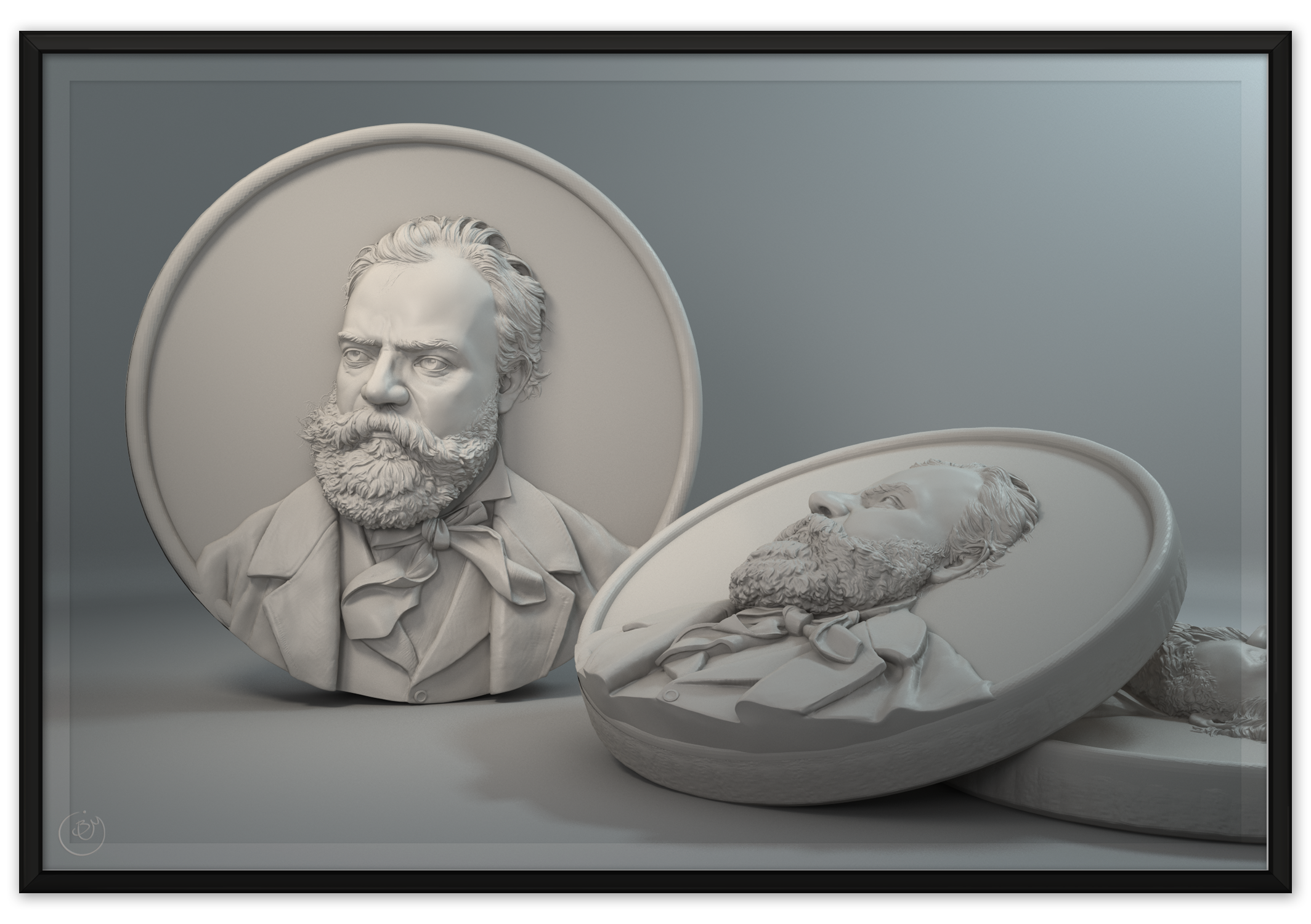
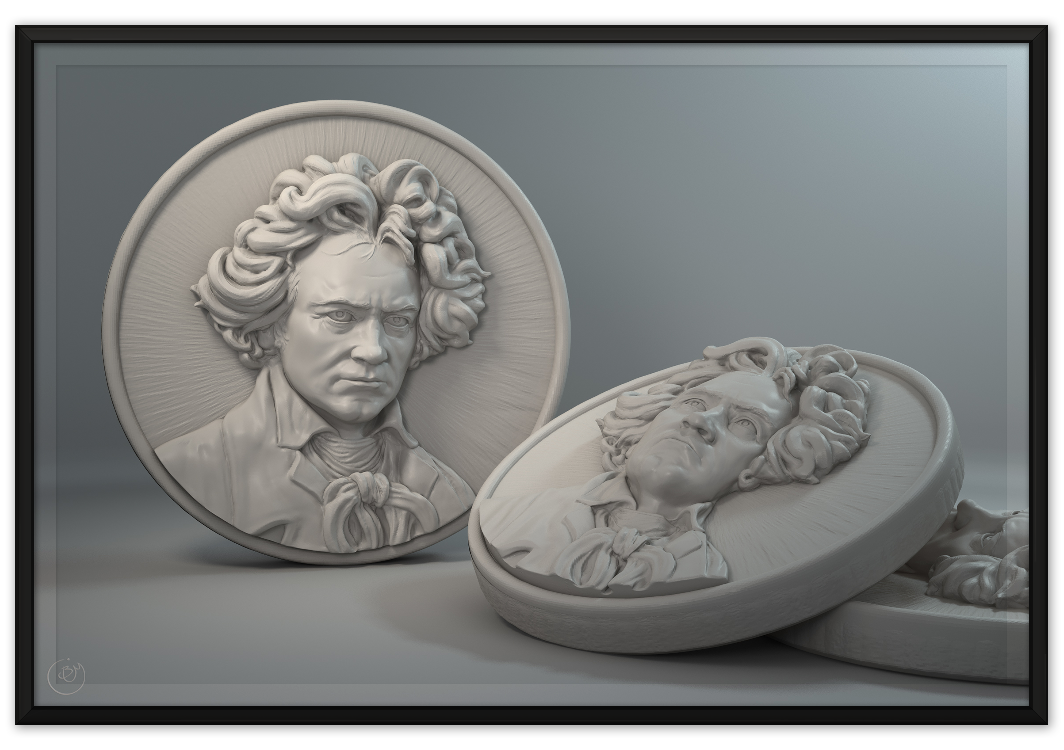
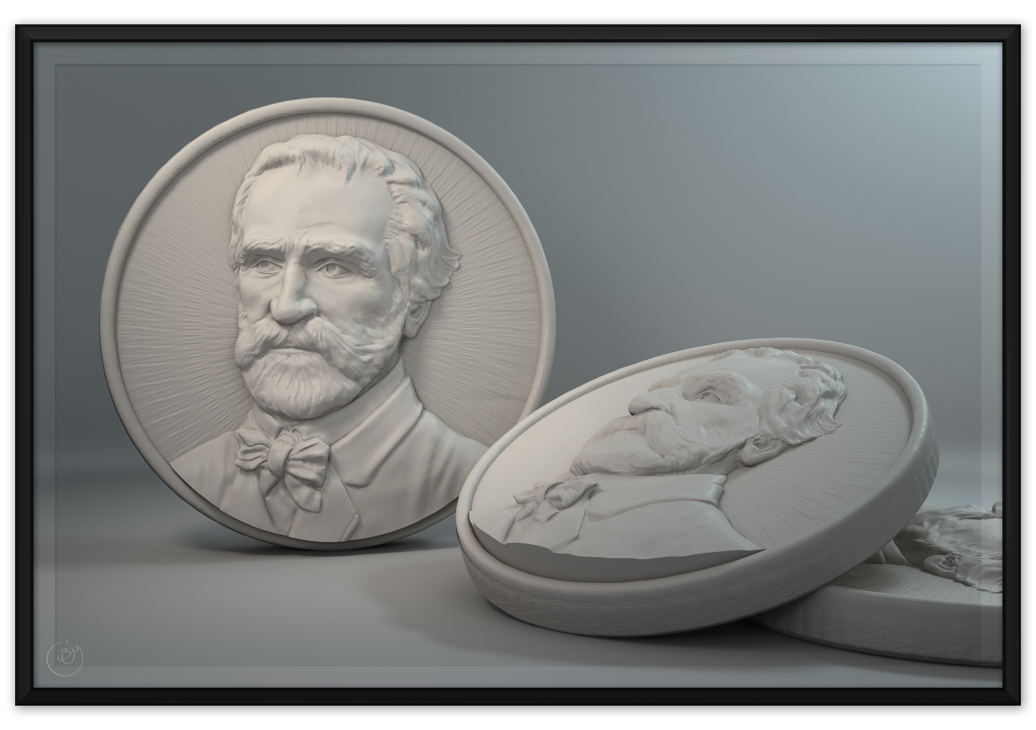
As you well know, the head is a box. When I first started creating reliefs, I tried sculpting full depth busts and flattening them down afterwards. This is what gives my Verdi, Schubert, Stravinsky, Beethoven, and Bach their unusually thick depths. It meant that my reliefs had an abundance of accurate depth and I spent a good amount of time trying to understand the flattening process. What stood out to me was that the box of the head could, in some ways, be skewed down to a plane using a simple bounding box. Using Maya's lattice tool and wrap deformers I created several simplified geometries to control that skewing. What I found is that the bony landmarks of the head are enough to accomplish the most basic elements of the flattening process. Of the three edges of the box visible from any angle, the two farthest edges are first brought into alignment along the axis of the base. This usually means that either the cheek or the face will begin to face more forward than previously. Once those two edges are in alignment, you can control the depth of the entire head using the third, centered edge that divides the side of the head from the face.
The observation that the center edge of bony landmarks (cheekbones, brow, jaw) determines the depth of the face and of the cheek is important for understanding the underlying depth of your portraits. It is a mistake to try to create a single crescent curve across the entire face (I tried that...). Simplifying the sides of the head to two primary planes will ensure that the details and forms you build into your portrait remain within the same basic planes throughout the process. If you're sculpting a three-quarter-view portrait as most of mine are, the face must appear to look in a consistent direction that is different from the direction faced by the side of the head. Too much ambiguity will make your entire portrait feel as if it is on the same plane!
Another thing I discovered about sculpting a full depth is that you will have much less control over cavities and intersections that form as you flatten the model. Even though you may have retopologized your meshes before you flattened them, the back sides of models will be lost within each other endlessly. Cleaning up the back side of a mesh that has been flattened is a chore. Picking through collapsed geometry in order to retain your subdivisions is something you'd rather not have to deal with, particularly with hair. One technique I used to identify the farthest visible edges of a portrait from a given perspective was to polypaint it from that view and draw thick red and black lines around the resulting edges until I had a clean line running just out of view. Masking off the visible portions, I attempted to smooth geometry between and flatten it as best I could. This familiarized me with the box skewing I mentioned earlier.
You will also need to perform the full, time consuming task of sculpting hair around the entire head. You can't even use quick lines, gestures, and less detailed strokes to obscure the edges because this is a trick that only works in two dimensional compositions! Many of the paintings I've been forced to use as reference for my composers depict hair in impossible poses for this reason. A more distressing problem occurs as you mix different references into your portrait. As most relief sculptors probably know, it's really really hard to change your composition after you've begun it. Working with a full bust prevents you from seeing your exact composition since you won't know how the depth will appear until you're finished. My Mendelssohn was plagued with contradicting references, from a beautiful sculptural portrait with dramatic hard planes to a natural portrait of the man to a hideous bloated etching made 30 years after Mendelssohn died (that's the one we went with for some reason). It was a mess. Combining an aging Stravinsky with his more youthful portraits had a similar, if less jarring effect on my processes.
A considerable effort went into either preserving or reinflating the features of the face after I flattened them. From the side your nose only has one forward facing surface. Getting rid of the geometry that used to describe the back side and then recreating the thickness you'd expect from a nose is a process best avoided. Manually rebuilding the depth of the eye sockets after all the details of the lids are in place is not ideal either. In general, always solve for your portrait's depth before you move in for the details.
My verdict, if you're here to avoid making quite so many mistakes, is that flattening a bust is much too much work and far too unpredictable. The majority of the time you spend on it will not be spent designing the portrait or even the depth but will instead be spent cleaning and repairing and making large sweeping adjustments to the depth. If you do try to conquer the flattening process, don't forget that a full bust is seen differently due to the perspective of your camera angle whereas reliefs have almost no distortion from your angle of view! If you'd rather not explore that path, proceed to the "Optimized Plates" section below for a description of how I usually get started.
Optimized Plates and Modern Tools
Working digitally gives us a lot of advantages over traditional workflows. The biggest is our ability to make larger adjustments using lower subdivisions without destroying the larger ones. Even if you're unable to resist the urge to jump up to the highest subdivisions early on in your workflow, you'll still benefit greatly from the move tools you have available to you. The downside of subdivisions is that they will eventually slow down your computer, inflate your files, and choke your 3D printing service. You may even run out of geometry before you're done detailing, forcing you to decide whether or not to go up yet another level just for that one spot. Working physically you won't find those sorts of obstacles but you will have to scrap a lot of detail to make larger changes.
One way I've used to avoid some of the above problems is to optimize the base mesh that I sculpt out of. As you divide, it's inefficient to also be dividing the back of your mesh. Distributed evenly, you will immediately lose 50% of the faces available to you to surfaces that will likely be covered by other meshes (even coverage is the case with dynameshing). Since I was working mainly with circular or oval bases, I decided to make a set of optimized base plates to start from. The front face is comprised of square gridded geometry because those faces will best hold all the varying details you can throw at it. As the geometry passes over the edge of the plate, it is reduced to larger and larger faces until it meets in the center of the back plane. The resulting plate has over 90% of the geometry facing forward where it belongs.
The downside to starting on a premade base with existing geometry is that stretching can occur in areas that have been heavily worked. These issues need to be addressed sooner, rather than later. I get around the issue by duplicating my mesh and using a combination of smoothing (to relax and evenly distribute the geometry) and reprojection to recover the original sculpt. I use the Zproject brush where possible but you may also use the Project All button in your subtool palette. You may even want to sculpt your base using dynamesh and then project it over to a more controlled plate.
A common technique I use for controlling my sculpting on a relief is to restrict the stroke to the forward/backward axis, then hotkey the button that turns it on and off. This allows me to quickly restrict movement to that axis so I can push and pull larger forms or create different effects as I cut in details.
Morph targets can be useful for reversing work you've done in the wrong direction. I sometimes get lost and spend hours sculpting everything all wrong. It does help to give me a better idea what was wrong in the first place but working backwards can be a pain. Morph targets will increase your file size much like masks and hidden meshes so keep that in mind as you save. Layers also serve their purpose, though I don't prefer them. Most of the details you sculpt will be built on top of one another and removing them will only invert your mesh in bizarre ways. If you're comfortable using layers to keep track of your work, give it a shot.
Using most sculpting programs you will have ways of overlaying or directly comparing between a reference photo and your sculpt. Zbrush allows you to dim the interface or to load an image into Spotlight or even directly onto the floor planes. In most cases, you'll need a controlled way of snapping both the image and the model into place so that you can correctly compare the proportions. I do this by shift-snapping the mesh to face forward, then hitting the focus button to automatically enlarge it to fit the window perfectly. Assuming your mesh's bounding box is the same and the interface hasn't changed, you can save out your spotlight and reload it whenever you want to compare. If you can't quite see your mesh through it, sculpt a few scratches through the spotlight and hide it (you may need to turn off Brush > Samples > Spotlight Projection) and use those as reference.
Before and during most of my portraits I try to break down my reference images in photoshop to better understand them. Whether it be sketching in the muscles, dividing the planes, circling the convex forms, or breaking the hair into readable chunks I find this habit to be a good way to dig deeper into your subject. The reference I used for Fanny Mendelssohn was designed as a sketch with loosely marked flowers and grains through her hair. On top of that it wasn't a very high resolution scan. I spent a lot of time laying out the design I would end up using to fill that space, squinting to read the forms I imagined I was seeing in the noisy pixels. Were it not for these presketches and for the research I did into common flowers used in wreaths the finished product wouldn't have turned out so well.
The major disadvantage with digital mediums is the lack of tactile interaction. You can't feel the model and it's very hard to see how it would realistically appear in a physical model. It's very difficult to keep the model lit and the details visible while you work. You do, of course, have faked materials to work with but it doesn't compare to real lighting and an more intimate understanding of your material. I have yet to find useful ways to simulate the real stroke patterns that result when working in clay.
Depth of the Features of the Face
The face is where the vast majority of us look to find the defining features of a portrait. That's where the muscles subtly twitch the skin in numerous different directions to produce the folds and rises that form our expressions. For these obvious reasons the face ought to be given as much depth as possible. In terms of accurate depth, the features of the face are very easy to compare to one another. Even though the closer eye has more depth to work with, you will still have to make sure it is clearly in front of the other. The profile that runs down the center of the face is something we see even when we look straight at it. We see how thick skin is, particularly where an expression has shifted it to form wrinkles. We know that as the head curves away from us foreshortening occurs. Incorporating these factors requires a good amount of depth to both represent the accurate depth and to hide it beneath carefully chosen interpretive depth.
In my reliefs, since they're mainly three-quarter-view portraits, I've used the nose to anchor my depth once I've established the boxy planes of the head. Of all the features of the face, the nose is the least compressible. You may not notice that the eyeballs aren't perfect spheres beneath their fleshy sockets but you will always notice a flat nose from these angles (from a profile view there's no issue). That's not to say you should give the nose everything, but it can be very useful for establishing a direction for the front plane. The nose prevents a viewer from comparing the eyes on either side of it because the angle of the nose is so easy to read. If you could compare the eyes, you'd find that they're almost at the same depth within my portraits. By giving the nose near to its full depth, you're creating new space for the rest of the features to occupy. The area hidden by the bridge of the nose creates a forced perspective that our minds rarely reject. In reality, there's nothing at all hiding behind your relief's nose. Lucky for us, the only way to convince the brain that the nose isn't actually in front of the rest of the face is to view the relief directly from the side and see that it merges straight back into the head.
The eye sockets are the primary beneficiary of the nose. Like the nose, flat eyes can be easy to spot. The only way to hide the eyes in a shorter depth, if you're going for that, is to be really careful with your edge falloffs as described in the section about that. You can't represent the lids as plate-like slabs with the planar divisions you'd expect on a highly sculptural statue. In such shallow depth you won't be casting the shadows that make those forms as useful as they can be on full busts. On a shallow relief you'll have to emphasize the roundness of flesh, exaggerate the edges to cause shadows from ambient occlusion rather than from light, and develop your own eye for answering these types of questions on the fly. Too little flesh and too much detail will give your eyes a graphical look which will stand out if you aren't working specifically for that depth.
When I approach the eyes, I attempt to create a good deal of roundness to the socket. I frequently refer to the profile of the brow and cheekbones. Even though that line isn't sculpted in full depth, I try to create as many accurate relations in it as possible. That bony line is already indicated by the edge of the foreshortened portion of the face and it's important to give the eye socket it's V shaped plane change along that line (with the cheekbone facing up and the brow jutting out). Bringing the socket backwards will give more flesh to the cheek and a broader surface along the side of the nose itself, lessening the need for it to protrude so far out. Since the eyes tend to be higher resolution that the rest of the portrait, I often separate them and sculpt them with higher divisions rather than dividing the entire portrait.
The mouth and chin create their own set of planes that stretch across the rest of the face. If you don't start them from the depths you will have a much harder time making your relief believable. Changing the depth of the chin impacts how your portrait's head transitions to its neck and can seem to add way too much to the depth of the face at times. I think this may be in part because of the dramatic ways in which the torso needs be compressed but it is also because most other edges of the face have been minimized and hidden away. The chin is the thickest unavoidable edge of the face. The vertically stacked planes of the place are much more comparable because they aren't foreshortened. The chin has a hard time escaping those comparisons, though the dip between the chin and lower lip as well as the flat plane between the upper lip and the nose tend to be what we see when looking at this area. As long as you create enough of these actual relationships between the planes, you may be able to bring the entire lower face backwards without triggering any awkward impressions.
As to the mouth, keep in mind that the nice pink border (the vermillion border) of your lips are the forward-most edges of the lips, not the point at which they return to the chin. That border comes to mind as you sculpt because it works in two-dimensional drawings due to its contrast with the color of your skin. In relief, remember to create an underplane to each of your lips and to dig the crease in enough to inflate the upper lip. Without space to inflate it, the upper lip appears flat rather than round. Try to avoid flattening the lips at all if you are using a deeper relief.
Foreshortening the mouth and the farther eye can be tricky. One side of the mouth will inevitably be shorter than the other and the fleshy forms that form at the far corner of the mouth will be less distinct. Use photo reference if you're not sure how much to foreshorten the mouth or at least try moving it back and forth to find out what looks right. The eyes can create similarly confusing forms. Not only is one eye more foreshortened than the other but one corner of that eye is more foreshortened than the other corner. On top of that, the eyes are one of the most defining areas of the portrait and you will always think there is something not quite right about them. Yet another factor to keep in mind is that the eyes must appear to face in the same direction even though the don't. The further eye doesn't have as much depth and its angle will be less steep than that of the closer eye. I have no easy answer for how to foreshorten spheres other than to keep trying until it works.
The last feature to discuss is the ear. The ear, or ears if you're doing a straight on portrait, are almost always too far back to be given an accurate depth. The nice thing about ears is that its details are mainly compared to each other and not to the rest of the face. The ear always has a certain thickness to it and the complicated helix and antihelix that make up its forms all exist on their own plane. Seen from the side, that plane is virtually parallel to the base plate and perpendicular to view, no matter how far off the head they come. The actual angle of the ear to the head should be captured in its foreshortening, not by tilting it outward. The eye will read that the forms of the ear are closer together or overlapping one another.
Seen from the front, the ear emerges from behind the far edge of the jaw. Recalling that this point may be quite shallow in depth, you'll realize why it's hopeless to capture the ear's actual plane. Strangely though, making the ear parallel to view causes it to point away from the angle of the cheek since the cheek is receding towards the plane. By being flat, it is in fact tilted away from the head ever so slightly. Further, by pressing the inside edge of the ear behind the far edge of the jaw, the ear tips slightly outward, increasing the different between the shallow receding cheek and the shallow emerging ear. The outer rim of the ear is what we recognize most, especially in terms of its edge falloff.
Always, always try to understand the unconscious and intuitive adjustments you're making in your art. Having an idea what you've been doing will help you to both recover from tough spots and to avoid them all together.
Hats, Hair, Necks, and Shoulders
Over time I've encountered a few rather interesting transitions in depth that need a bit more trickery to capture. The most unusual one, to me, has been Puccini's hat. The brim of a hat is already very thin but somehow, within that small gap, the hat juts forward by half a head's length. Since my client works in glass, even a slight lip would have been too fragile and with so much of the underside visible it became something of a nightmare trying to come up with exactly the right look for it. I also had to consider that the underside of the hat was visible in places that would actually be behind the head! Hopefully the solution isn't terribly obvious. Since the brim of the hat is separated from the rest of the portrait, I designed the upper section of the hat to have its own relative depths and used the intervening blank space to blend the two reliefs back together. Puccini's forehead is actually tipped almost all the way back to the plate's surface and portions of the hat dip into the plate itself in order to increase the depth of the hat without causing it to stick out of the surface.
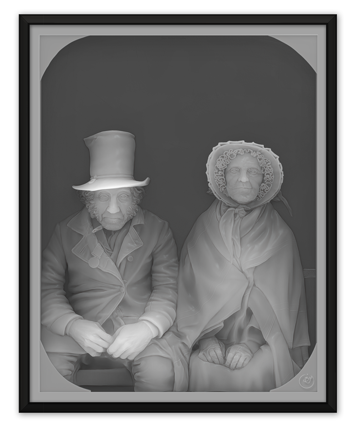
I did do a few other tricky head pieces as well. My relief based on "A Veteran and his Wife" included a top hat but the brim wasn't tipped upwards and I created a much less troublesome illusion of depth for it. Fanny Mendelssohn's hair includes a wreath of flowers (periwinkle I think) and grains that are partially contained within the original mesh and partly split off onto their own meshes. The overall depth of the hair was carefully chosen to complete the shape you'd expect from the skull rather than the potentially expansive hair. The planes of the hair change behind the largest of the grains and the dense array of flowers obscure the falloff so that I could continue the spreading plants and stray hairs out onto the surface of the plate.
Bach's hair was rather unique in that it was designed for a full bust that I made for him and flattened down. He wears a wig made of cylindrical objects, each of which had to be reinflated to bring out the right amount of roundness after the initial flattening. The wig was cut into tiers so that I could work with the back rows separately from the front ones. I decided to give the wig a thicker border on the forehead so that it would be more apparent that it was a wig, though I would assume that these lines were made less distinct.
Beethoven, Mendelssohn, and Schubert all had curly or unkempt hair. Being new to sculpting at the time, I had no idea how to accomplish their hair for the full bust and the path to their finished products was a messy one. Dealing with the cavities and intersections that occur as the hair curls compressed down to the scale of my reliefs wasn't the most inspiring part of the project.
In addition to being difficult, hair is also a great way to hide the accurate depth of the face. Hair creates sudden transitions that no longer have to follow the predictable curve of the skull. Placing the hair within its depth is usually one of the last things I consider because the features of the skull have specific places to be. Hair covers the ears, it splits the cheek, it shadows the far profile of the face, and it smooths over the back of the neck and forehead. It's most distracting element is in its textures and patterns which curl and flow across the piece and drag a viewers eyes away wherever you please. The hair is so unreadable that you often can convert compositions designed especially for two dimensions into three without giving away their lack of sense (Beethoven's curls make very little sense taken from the side). I find it nice to design the depth of hair in masses similar to ear muffs so that they cast shadows that help to describe the profile of the hair.
Covering another large portion of the head's edges is the neck and torso. From most angles the neck is forced to be a good distance back from the chin, making it hard to include the details that would describe its forms. Since the edges of the neck are very similar in depth and angle to the ones found on the face, they may end up looking slab like. There's not a whole lot to be done other than to experiment with the anatomy you know is there or to use the other end of the neck to your own advantage. My subjects were nice enough to wear tight collars about their necks so that I could easily transition down to the neck and back up again without seeing how awkward it looks (Abraham's a good example). Fanny's neck and shoulders are one of my favorite attempts at capturing the internal forms of the neck and shoulders.
This brings me to the torso, which is its own set of guesses. Past the neck, you'll have quite a bit of room to fill the depth back out as the chest emerges. Certain issues begin to occur as you realize how wide the torso and shoulders are compared with the head. Such dramatic changes in depth would destroy the plane of the chest so some happy medium must be found that keeps the close shoulder from punching out into space and that keeps the far shoulder from flattening down to a few subtle details. Emphasizing the local depths of cloth folds and layers as well as using more distinct planes on the tops and sides of the shoulders can help hide the fact that they are both at the same distance and that the far shoulder is likely in front of half of the face.
One thing that I found useful about the neck transition is that you can swap out the torso without all that much effort. The head and torso function on their own independent depth systems already. Deciding which direction to face the torso can have a major impact on the finished composition of your piece. Even the small sections of torso that I've used can tell you about the postures and bodies of the composers they are attached to. My Lincoln was based on two separate photographs: one of his face and another of his torso.
Death Masks and Life Masks
You may find this an unusual addition to this list (if you've made it this far) but I've found death masks and life masks to be incredibly revealing about the actual faces of my subjects. Lincoln's is actually available to be downloaded as a 3D scan. These masks are almost always of the face by itself since hair wouldn't have molded correctly. They serve as great ways to provide definitive answers to the inconsistencies between portraits.
In a similar way, comparing the portraits of a subject throughout their lifetime can help you understand what is unique about their face. It takes a long time to see what your parents mean when they insist that you look like one or the other of them because most of you is still growing and maturing. The standout features are obvious to them but you'll have to wait until you grow up to see it too. Many of the composers I sculpted had numerous photos, paintings, etchings, sketches, and sculptures done throughout their lives and just as many after. trying to find the real, lasting face within each of those is quite interesting.